Tuesday, December 20, 2016

End of Semester Update

Semester Update

Project:

       
       Hello again, people of the internet! Since my last post I have been working almost non-stop on this project. I'm have been drawing frames for the majority of my time and I have been able to complete one of the first scenes in my animation. I have developed a process for my animating. First I hand draw all of the frames individually. Then I scan them onto my computer and open them in photoshop. I trace my drawing and color the frames all in photoshop. Once I have finished coloring all my frames I create a timeline and arrange them in order. I finish any animation and render the scene in aftereffects.


I came up with this animation after sketching the characters that you see on the left. I imagined that they were monster brothers who live in the forest surrounding a medieval village. The villagers think that they are evil so they are forced to hide in the forest. One day they find a human baby abandoned near their home and they take it to care for it. They must return the child to the village without being attacked by its residents in the process.


With help from my classmates I have learned how to use photoshop and aftereffects to make a 2d animation. I am going to continue working on this project next semester and hopefully finish in time to enter it into a local contest. 

You can watch the first scene of this animation here:   

Tuesday, October 18, 2016

Beginning of the Year Update

Beginning of the Year Update

Hello internet! I have returned after summer break and started on a new project. This animation is different from my former projects because this is going to be a 2d animation. All of my projects last year involved 3d programs such as Maya. The last time I did a 2d animation I was in my sophomore year. So one of my goals for my senior year was to get back into 2d. 

I started this project by drawing a few sketches of the characters I wanted to animate. After I finished that I began creating my storyboard. I created the storyboard first so I could have a reference for all of my future steps. Currently I am drawing all of my frames. This will be the longest step and I still have a long way to go. After I finish drawing the frames I will scan them onto the computer and arrange them using Photoshop or Aftereffects.
My story is about these two monster brothers that live in the woods. One day they find a child abandoned in the woods and they must return the child to the village.

This project will be a challenge for me since I haven't done 2d animation recently. Hopefully I will finish quickly and won't have too many delays.

Thursday, May 19, 2016

End of Year Collection

End of Year Collection

Hello people of the internet! This is the last time I will be speaking to you all until I return from summer break. In this post I will be sharing all of the projects that I have created throughout this year. Many of these you might have seen in some of my earlier posts so don't be surprised if some of these look familiar. 


If you remember my very first project of the year then you'll recognize this little fellow. His name is Kringle Claws and he was my practice project. He is my first humanoid creation in Maya and I do think that he could be improved. I mainly created him in order to get myself used to Maya after a long break. 


This next project is probably my proudest work of the year. His name is Asger and he took way to long to create. I believe that he is my best work of the year and I think that the time I spent on him was well spent. I went for a more cartoony tone for him than I did with Kringle Claws. This decision to create a more cartoon like character was my smartest decision in the process of creating him.

The project that I did immediately after I finished Asger was very small. This hammer was a spur of the moment decision and did not take that long to make. It is meant to resemble Thor's hammer Mjolnir. I created it to go along with Asger and I think I successfully made it resemble the same style as our Viking friend.

This is my most recent project and it was made in response to a prompt given to us by my instructor Mr. Netterville. The prom was to create something that represented the passing of time. After a few days I settled on showing time pass using an ancient sundial. I created the strange shaped sundial by drawing what I wanted it to look like and using that image as a reference while I created it in Maya.
I created the shadow effect by creating a light in Maya and rotating it around the center of the model.

End of the Year Reflection

End of the Year Reflection

Throughout the course of this year I have learned how to better use the 3D modeling software Maya. In Maya I've learned how to use different tools to make the modeling process easier and I have also learned how to paint weights onto a rigged model. Learning how to new tools(like the bridge tool and the insert edge loop tool) have made the modeling process easyier for me. And learning how to paint weights is important because someone has to paint weights before moving the joints on a characters skeleton. If this is not done then areas of the model would be moving when they are not meant to.

I learned how to do this by watching online tutorials and also by just practicing with the program. First I started by looking up some tutorials on the Internet. These tutorials gave me a starting point. With the basic knowledge I learned from the tutorials I simply began modeling by myself and practiced regularly. In addition to this I also sought help from my instructor and my peers when I faced a problem that I was having trouble with.

I chose to focus on 3D modeling this year because I wish to become a game designer one day and 3D animation is an essential part of that field. Learning how to create 3D models and animating them now will save a lot of time and frustration later. In addition if I can teach myself how to improve in Maya then I can use the same methods to improve my skills in many other programs. The strategy that I used this year can apply to many different programs.

As I previously stated, I have improved greatly in modeling 3D characters. I have a solid understanding of how to construct a model or environment. But my skills in 2D animation have not improved this year. This is mostly because I have not done any projects that involves 2D animation. I am much more comfortable using 3D programs such as Maya than I am with 2D programs such as Aftereffects.

As I said before I would like to one day create video games. Based on what I've done this year I think I would enjoy creating character models for games the most. Although having an understanding of how the model will move is an important part of creating the model. Next year I hope to further improve my skills in 3D modeling and animation. Although I also hope to get back into 2D animation and review the basics of that style.

If I could go back and change anything I would most likely do a little bit more 2D animation. I would do this just so I wouldn't become so rusty. I do not regret focusing on 3D because I feel like that will be most useful to me in the future. But I would still like to have an understanding of 2D animation just so I can do it in my pass time.

This year I have improved my skills in creating 3D models. I know that this improvement will help me in the future, especially since I plan on going into the game design industry. But I have also become rusty in regards to 2D animation. Next year I plan to reintroduce myself into 2D animation while still continuing to enhance my skills in 3D animation.

Friday, May 13, 2016

Maya UV Mapping Turtorial

Hello people of the Internet! Today I will be explaining the basics of UV mapping in the 3D modeling software Maya. UV mapping is used to make a texture fit inside a face. So if your texture is to small or to large you can use UV mapping to make that texture fit on a face. This tutorial is meant for people who are just beginning to use maya so there will not be many advanced concepts in this post. Now that the introduction is over we can start the tutorial.


1. Set Up
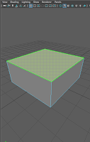
In this example I will be using a simple cube (left) for the object and the happy face as the texture (above). So I select a face on the cube and create a new lambert. Then, in the attribute editor I select the black and white box next to the word color and select file. From there I choose the happy face texture.


                              2. Opening UV Editor

Now I have a cube with a texture on one of the faces. But the texture does not fit on the face. This is where we begin to use UV mapping. To open the UV editor I just selected the UV tab on the main menu and from there I just select UV editor. NOTE: The UV tab will only show up on the main menu if the menu is set to the modeling category. Now the UV should pop up as a separate tab (right).


3. Using the UV Editor
To use the UV Editor I select an edge and simply move it within the UV Editor screen until the texture lines up correctly with the face. The end result has the texture fitting on the face.


                                      Using UV Mapping we have created a very happy cube!


Wednesday, May 11, 2016

"Acting and Animation" Review


Hello people of the Internet! Today I will be reviewing an article titled Acting and Animation by Doron A. Meir. I highly recommend reading the full article before continuing with this post. You can find the article -> here <-.

The article title is rather self explanatory. In the post Meir writes about the similarities between acting and animation. He mainly focuses on the aspect of "believable acting" and how a characters personality and mood will effect how it will look. The author provides a great definition of "believable acting." He describes it as "the character's actions are the result of its own inner motives." Meir effectively expands on this idea throughout the article and separates it into six different subsections: Feel, think, react, consistency, personality, and mood.

There author does a good job at explaining his ideas but he does not provide many examples of what good acting in animation looks like. This could be because no two characters are the same but it would still be helpful to find at least one or two examples.

The conclusion of the article is short but effective. He writes a quick summary of the whole article and has a satisfying final statement.

The authors argument that acting and animation are similar is believable. As someone who is involved in both theatre and animation I can easily understand how he could make this comparison. Both involve portraying a characters emotions through actions. Granted in theatre the quality of acting depends on line delivery. In animation voice acting is also a very important part of making a memorable character. But animators are usually not the ones voicing their creations. So animators are responsible for letting a characters emotions show through body language and movement.

Personally I love this article and believe that is a good read for any character animators. I am a bit biased due to my love for both acting and art. But disregarding my views  Meir did a fabulous job at writing the article in a way that is easily understandable. So if you people for some reason haven't read the article yet GO READ IT.

Thursday, March 10, 2016

"The Present" Short Film Review


"The Present" Review

By Tim Collins


           Hello people of the internet, today I will be reviewing another animated short film. This animation is titled "The Present" and I personally think that this is an excellent story. Beware there will be spoilers in this review so before you continue reading go watch the original video here https://www.youtube.com/watch?v=96kI8Mp1uOU.

     
         So for those who did not click the link here is a quick summary: A teenager's mom brings home a box for her son and when it is opened a puppy jump out of the box, but this puppy is missing one of its legs and the teenager rejects it for this reason. Although when the teenager sees how dang cute the puppy is he decides to accept the puppy. But when the teen stands up to play with the puppy it is revealed that...(wait for it)...the teen is missing a leg as well!

         The character models are impressive and the textures,  especially on the dog, are outstanding. The animation itself is great, the animator follows all the basic principles of animation. Most noticeable is the use of squash and stretch. This can be seen from 1:45-1:47 when the teen kicks a ball that bounces around the room.

         Based on best practice the creator did great throughout the animation. As I have said the textures, models, and animation are all spectacular. However I did notice at a few points throughout the story the animation seems to be too fast. I first noticed this around 2:04 in the video where the puppy(who is under a box) runs into a wall. It might have been done on purpose but to me it seems unnatural.

         Overall I thoroughly enjoyed this animation, it has an interesting story and is definitely high quality.


Tuesday, March 8, 2016

Meet Asger


                               Meet Asger


By Tim Collins


                  Greetings to all the people of the internet. In this post I will be showing off my most recent project and also giving a short update. 

                 Since last semester I have started on different project that involves new characters and a new story. I am still in the modeling phase and have already completed one of my two characters. My two characters are a pair of vikings, the one that I am sharing with you today I have named Asger. 

         During my first pre-production phase I began drawing some character designs and eventually decided to use the concept of a pair of vikings going on an adventure. Once I had my concept down I began modeling Asger right away. And after many weeks of trail and error I finally finished his 3d model. Now I am working as fast as possible on my other character, who is yet to be named, and the environment I plan on putting them in. 


               Compared to my previous work this style is much more stylized and not as realistic. This is because I attempted creating Asger as a realistic looking character but I felt that a more cartoony appearance would fit the theme better and it would be much easier and faster to create. For being my first stylized character model I feel that I did decent. Along the way I learned further how to paint weights using Maya. My biggest problem I had involved attaching the belt to his body. The problem was that I had already painted the weights onto the model but I had not attached the belt yet. So I had to undo the weights, attach the belt, and then repaint the weights. Now I know that you should make sure you completely finishing building the model before you start painting the weights.

                       The only problems that I have with this model is that the area under the arms the skin has slightly folded into itself. I tried smoothing the area but everything I did either made it worse or did nothing at all.


Recently I entered a 360 degree spin of the Asger model into a local contest called eMagine. I doubt I will win any awards for it, but I am still proud of this model. I will definitely make another post for this project when I finish it.